nebo.css: Concave Corners Made Easy
Alexander Pershin
Sometimes it feels like designers invent interface patterns just to mess with developers. A concave corner is one of those.
“Inverted”, “concave”, “negative” corners — also known as negative border radius or inverted border radius. If you hear any of that, brace yourself. Pain is coming.
The problem is that the pattern looks simple, but there’s no native way to create such a corner in CSS. So people resort to piles of extra wrappers and oceans of positioning styles. And all of that immediately falls apart on non-uniform backgrounds.
In this article, I’ll show a simple way to create concave corners using an open-source CSS library that I built specifically to solve this problem.
Why inverted corners are a pain
Meet our hero in the screenshot below:

The most common implementation usually looks like this:
add extra wrappers and pseudo-elements;
absolutely position all the pieces;
tweak radii, sizes, and offsets.
In practice, this gives you tons of code per corner and a fragile solution that’s painful to maintain.
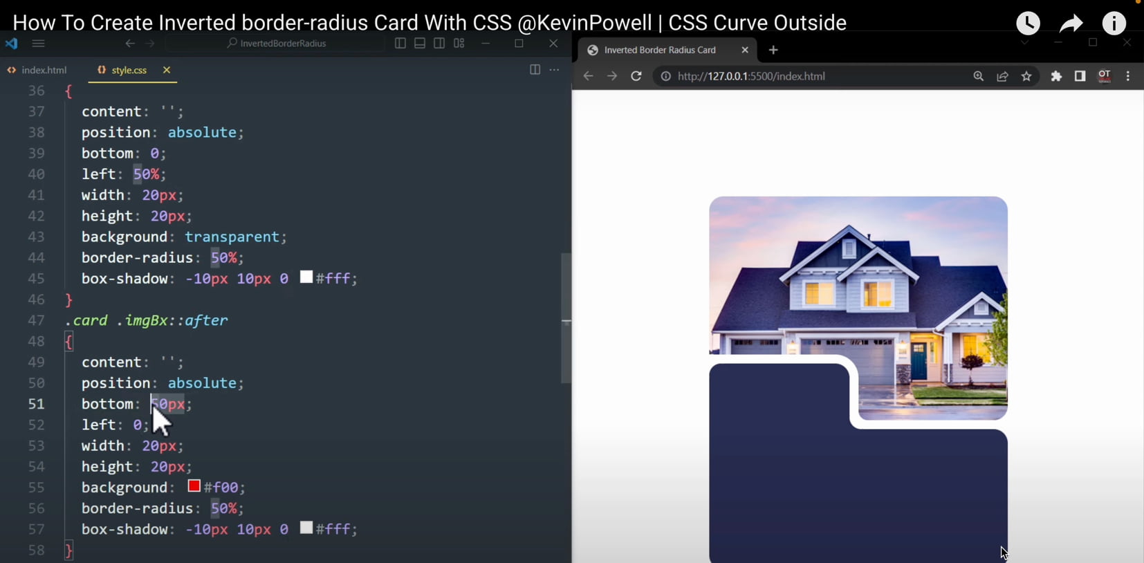
Below is a screenshot from a popular video about concave corner implementations. What you see here is roughly one fifth of the total implementation code.
Background issues
Typical solutions work only on solid backgrounds. As soon as the background becomes non-uniform, you have to switch to SVG. And CSS pain turns into SVG pain.
The dream solution for concave corners
What does a developer dream of when facing a concave corner?
a simple pure-CSS solution;
working out of the box, including on complex backgrounds;
native customization of corner size and shape.
Good news: such a solution exists. It’s called nebo.css, and that’s what we’ll explore in this article. The name comes from the pattern itself — negative border radius.
Installing nebo.css and creating your first concave corner
nebo.css is a single CSS file, very much in the spirit of normalize.css: include it — and start using it. There’s no JavaScript inside, everything is done with pure CSS.
Include the library
<link rel="stylesheet" href="nebo.css">That’s all you need to get started.
Add a single corner to a card
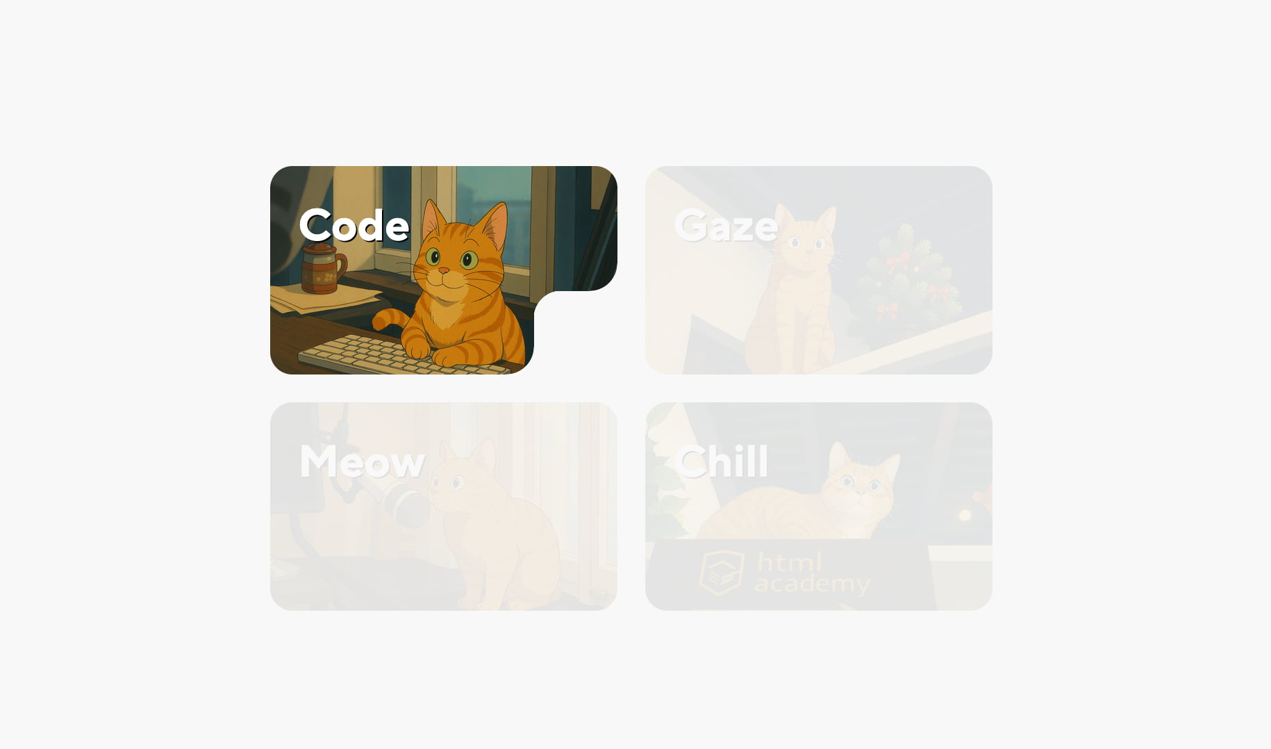
To add an inverted corner, the element needs the base class nebo. By default, the corner appears in the bottom-right.
<article class="card nebo">...</article>Result:
Changing the corner position
The position is controlled by modifiers:
nebo--tr— top right,nebo--tl— top left,nebo--bl— bottom left,nebo--br— bottom right.
<article class="card nebo nebo--tr">...</article>Result:
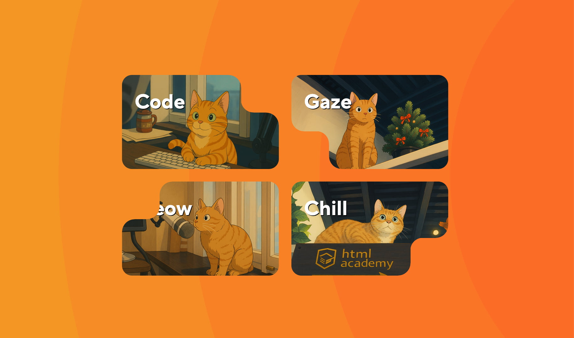
At this point, an important thing becomes obvious: the corner works correctly even on non-uniform backgrounds, with no extra tricks.
Basic customization
All nebo.css parameters are controlled via native CSS variables that follow the standard cascade.
Base radius: --nb-r
This variable controls the corner radii. The default value is 20px. Let’s make it a bit smaller.
.nebo {
  --nb-r: 16px;
}
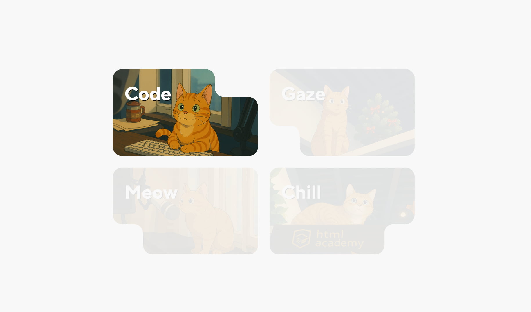
Cutout width and height: --nb-w and --nb-h
These variables define additional offsets between the inner and outer radii.
.card--cat1 {
  --nb-w: 42px;
  --nb-h: 16px;
}
Result:
Different settings for different elements
Since this is just the regular CSS cascade, each element can be customized independently:
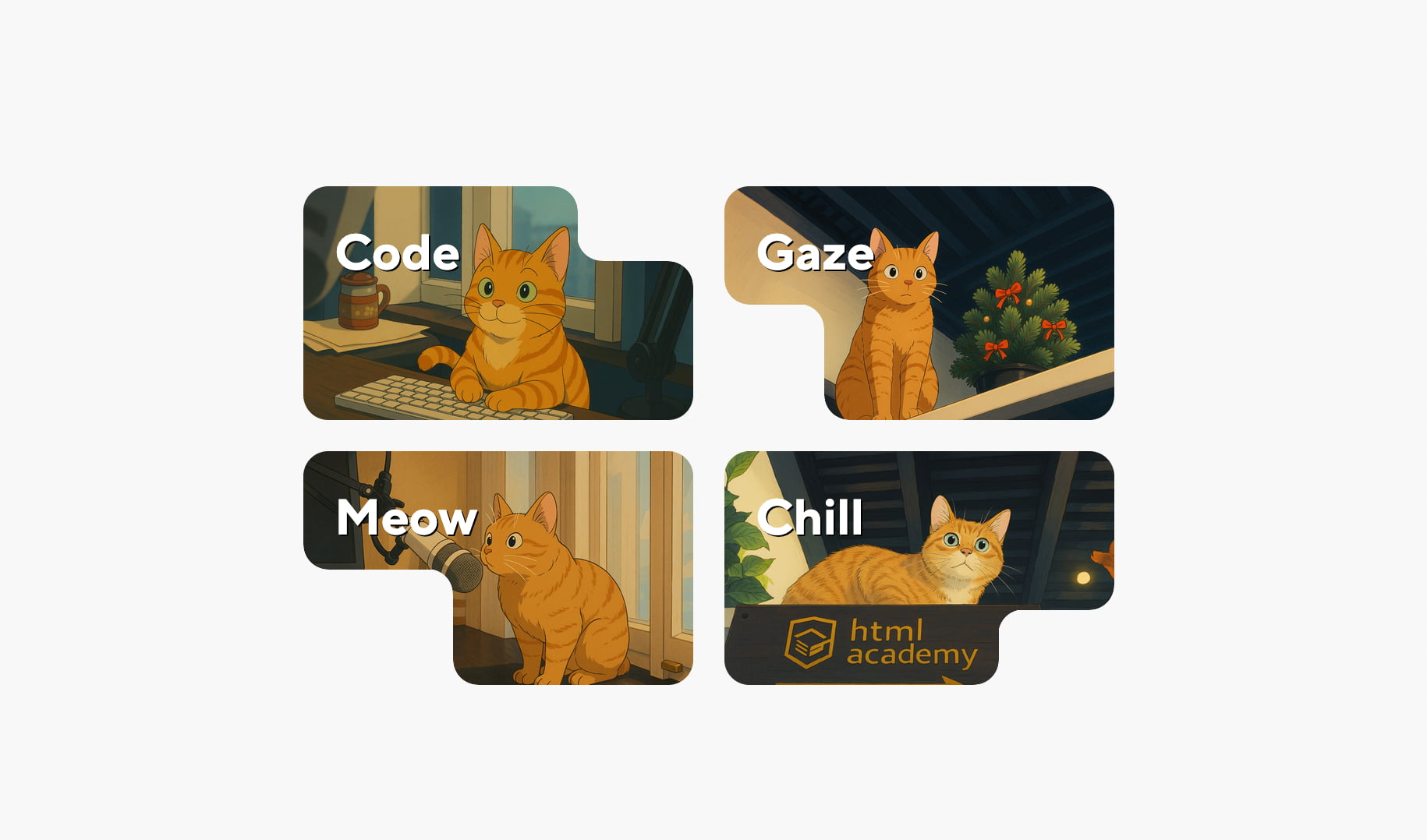
.card--cat1 { --nb-w: 42px; --nb-h: 16px; }
.card--cat2 { --nb-w: 32px; --nb-h: 42px; }
.card--cat3 { --nb-w: 64px; --nb-h: 42px; }
.card--cat4 { --nb-w: 42px; --nb-h: 16px; }
Result:
By the way, corners render correctly even with zero values (0px) — just don’t forget the units.
Multiple concave corners on a single element
nebo.css is intentionally designed around a simple rule: one element — one corner. But if you need more, there’s a proven technique — extra wrappers.
Using wrappers
<div class="card-wrapper nebo nebo--bl">
  <article class="card nebo nebo--tr">...</article>
</div>
Result:

Each level can be customized independently using CSS variables. You can build three or even four corners — just by stacking wrappers.
Advanced customization
The base radius defined by --nb-r can be overridden separately for each of the three curves: two outer corners and the inner curve. Both horizontal and vertical radii can be set independently using six additional CSS variables:
--nb-cor1-rw,
--nb-cor1-rh,
--nb-cor2-rw,
--nb-cor2-rh,
--nb-curve-rw,
--nb-curve-rh,
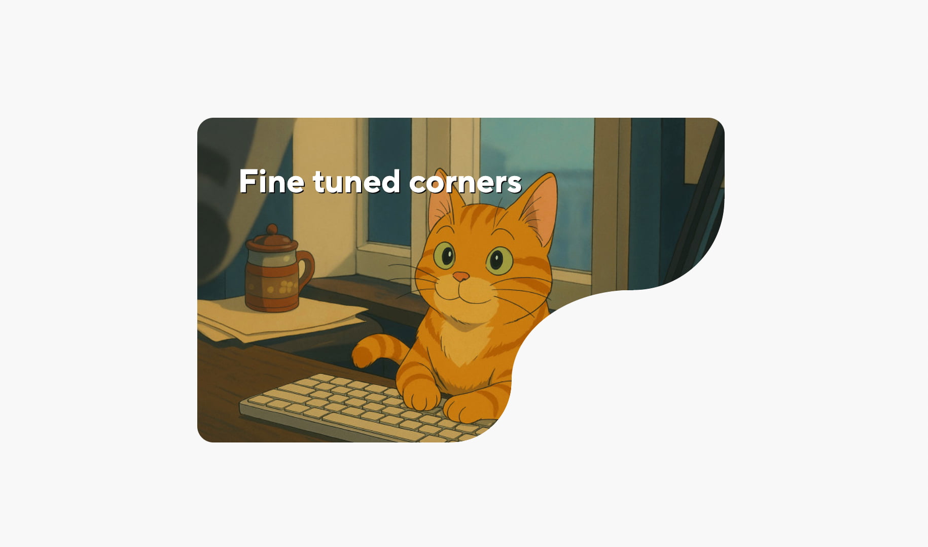
These variables allow you to create concave corners with very complex shapes. For example:
.card--cat1 {
  --nb-r: 30px;
  --nb-w: 0px;
  --nb-h: 0px;

  --nb-curve-rw: 120px;
  --nb-curve-rh: 90px;

  --nb-cor1-rw: 90px;
  --nb-cor1-rh: 90px;

  --nb-cor2-rw: 60px;
  --nb-cor2-rh: 60px;

  --_nb-smooth: 99.5%;
}
Result:
Case study: a two-block card
Now let’s look at a more realistic example — a card consisting of a top image block and a bottom content block.
Markup
<div class="card">
  <div class="card-header"></div>
  <div class="card-body">
    <div class="price">$114,000</div>
    ...
  </div>
</div>
Adding concave corners
<div class="card-header nebo nebo--bl"></div>
<div class="card-body nebo nebo--tr">...</div>
Tuning parameters and merging blocks
This example uses a quick and dirty trick with negative margins to pull the image block closer to the content block. The goal here was to demonstrate how easy it is to create the cutouts.
.card-header {
  --nb-r: 10px;
  --nb-w: 130px;
  --nb-h: 44px;
  margin-bottom: -54px;
}

.card-body {
  --nb-r: 10px;
  --nb-w: 160px;
  --nb-h: 44px;
}
Result:
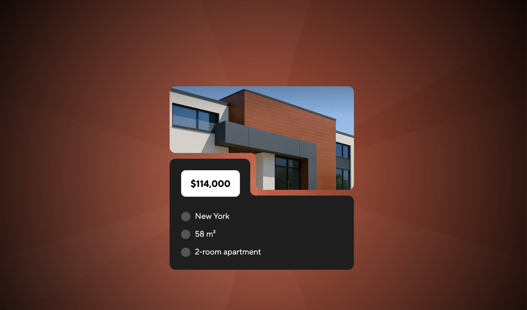
Notice that everything works perfectly on non-uniform backgrounds.
Where to get nebo.css
nebo.css is a free open-source library developed by the author. It’s hosted on GitHub.
Repository: https://github.com/htmlacademy/nebo.css
You can include the library as a separate file or copy the code directly into your styles. Use it — and enjoy!
The complete code lives in an interactive, step-by-step demo — you can go through the examples at your own pace and play with the parameters along the way.