Building a complex progress bar in 2026
Alexander Pershin
Back in the day, building a circular progress bar meant suffering with SVG. Even now, opening DevTools on some of those old implementations still hurts. Today, things have become dramatically simpler.
Modern CSS lets us build a complex, flexible, and visually pleasing circular progress bar using literally a single div and a single CSS property. And all of that comes with excellent browser support.
In this article, I’ll walk through this exact technique. We’ll start with the core idea, then move on to customization options. After that, we’ll add a bit of visual “polish”, convenient control knobs, and some experimental CSS logic. Yes — at the very end, we’ll even do a bit of programming in CSS.
The core idea and a basic implementation
Let’s start with the most important part. The entire implementation revolves around a single element:
<div class="progress"></div>And a single property — background-image with multiple background layers. The core idea is simple:
the top layer is a radial gradient that defines the shape of the scale;
the bottom layer is a conic gradient that controls the fill.
Here’s the basic CSS:
.progress {
  width: 150px;
  height: 150px;
  background-image:
    radial-gradient(
      circle,
      #222 0% 27%,
      transparent 28% 50%,
      #222 51%
    ),
    conic-gradient(
      #D64E42 0% 60%,
      transparent 60%
    );
}
The radial gradient on top creates the “donut” — a scale with a transparent cut-out center. The conic gradient underneath fills a sector of the circle, effectively controlling the progress.
It’s worth noting that this approach relies on old — one might even say “ancient” — CSS features: multiple backgrounds, radial and conic gradients, and hard color transitions.
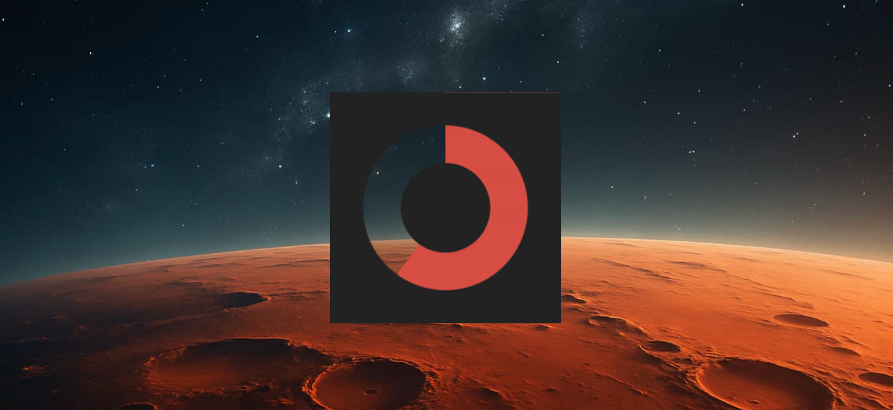
This is the key technique that forms the foundation of the progress bar. Everything that follows is just customization and layering on top of it.
Customization: scale thickness and transparency
One of the nicest things about this approach is how easy it is to customize.
Scale thickness is controlled by the parameters of the top, radial gradient. We simply tweak the color stop positions:
radial-gradient(
  circle,
  #222 0% 30%,
  transparent 31% 54%,
  #222 55%
)
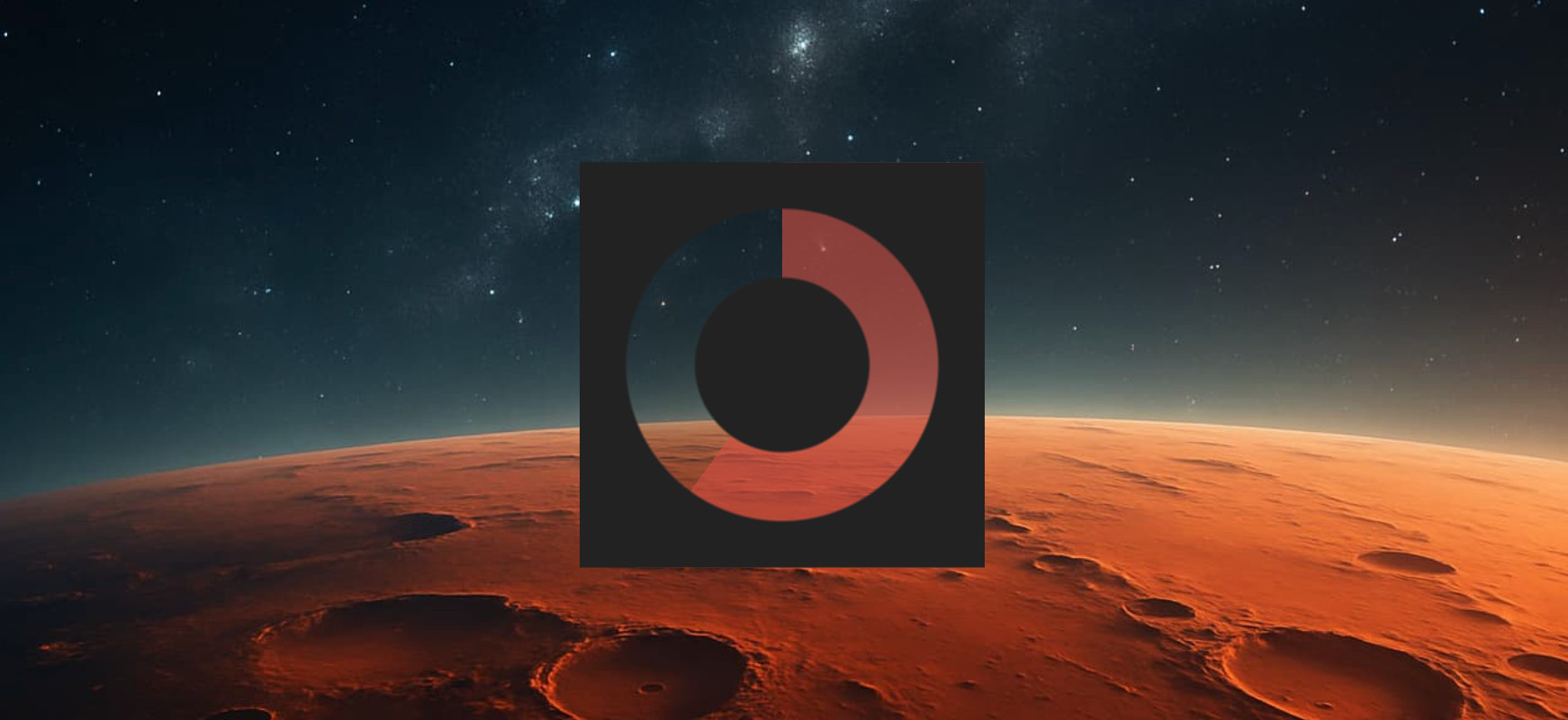
Color and transparency of both the scale and the fill are controlled by the bottom, conic gradient. Change the first color stop to a semi-transparent color — and the fill becomes translucent. Change the second color stop — and the empty part of the scale changes.
conic-gradient(
  rgba(214, 78, 66, 0.6) 0% 60%,
  transparent 60%
)
No extra elements, no masks, no calculations. Just gradient parameters.
Making it look good: texture, borders, and shadows
The basic version works, but it looks a bit rough. Let’s add some visual “expensiveness”.
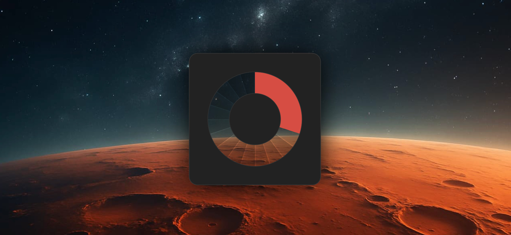
First, we add a third background layer — a repeating conic gradient that creates subtle radial sections:
repeating-conic-gradient(
  rgba(0, 0, 0, 0.3),
  rgba(0, 0, 0, 0.2) 4.5%,
  transparent 5%
)
Second, we make the top radial gradient more complex by adding intermediate colors to create thin borders:
radial-gradient(
  circle,
  #222 0% 27%,
  #333,
  transparent 28% 50%,
  #333,
  #222 51%
)
And finally, we slightly round the progress bar itself and add shadows:
.progress {
  border-radius: 10px;
  box-shadow: inset 0 0 1px #666, 0 0 30px black;
}
None of this affects the logic of the component — it’s purely visual.
Control knobs: CSS variables
Now let’s make the progress bar practical for real interfaces. To do that, we introduce a CSS variable called --progress.
.progress {
  --progress: 45;
  --corner: calc(1% * var(--progress, 0));
  background-image:
    radial-gradient(
      circle,
      #222 0% 27%,
      #333,
      transparent 28% 50%,
      #333,
      #222 51%
    ),
    conic-gradient(
      #D64E42 0% var(--corner),
      transparent var(--corner)
    );
}
Now progress is expressed as a clear number from 0 to 100, and CSS automatically converts it into the required angle.
It’s easy to create multiple instances of the component:
<div class="progress" style="--progress: 15"></div>
<div class="progress" style="--progress: 50"></div>
<div class="progress" style="--progress: 90"></div>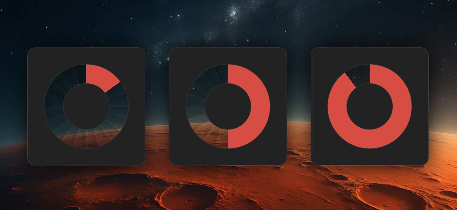
Experimental CSS features: conditional logic
Now let’s take a small peek into the future of CSS. In modern versions of Chrome, you can already use conditional logic via if().
For example, you can change the scale color depending on the progress value:
.progress {
  --color: if(
    style(--progress <= 33): #D64E42;
    style(--progress <= 66): #F5B848;
    style(--progress <= 99): #58B473;
    else: white;
  );
}
And then use that color in the gradient:
conic-gradient(
  var(--color) 0% var(--corner),
  transparent var(--corner)
)
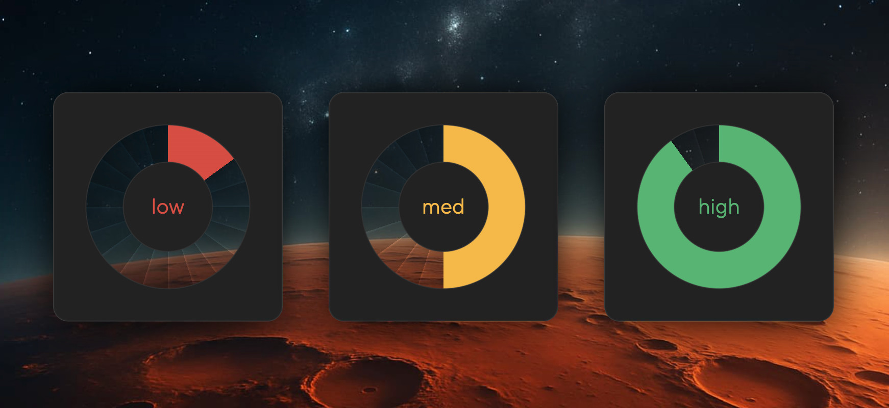
You can also add a label in the center of the progress bar that changes depending on the progress value. We add a pseudo-element and use if() in the content property to bind the label text to progress ranges. For the label color, we reuse the parent’s --color variable.
.progress {
  display: flex;
  justify-content: center;
  align-items: center;
}

.progress::before {
  content: if(
    style(--progress <= 33): "low";
    style(--progress <= 66): "med";
    style(--progress <= 99): "high";
    else: "go!";
  );
  color: var(--color);
}
Important: these are experimental features. If you need solid browser support, use JavaScript together with modifier classes instead.
Wow factor: native animation
And finally — the fun part. This progress bar works beautifully with native CSS animations.
First, we register the --progress variable:
@property --progress {
  inherits: true;
  initial-value: 0;
  syntax: "<number>";
}
And then animate it:
.progress {
  animation: progress 10s infinite alternate;
}

@keyframes progress {
  to {
    --progress: 100;
  }
}
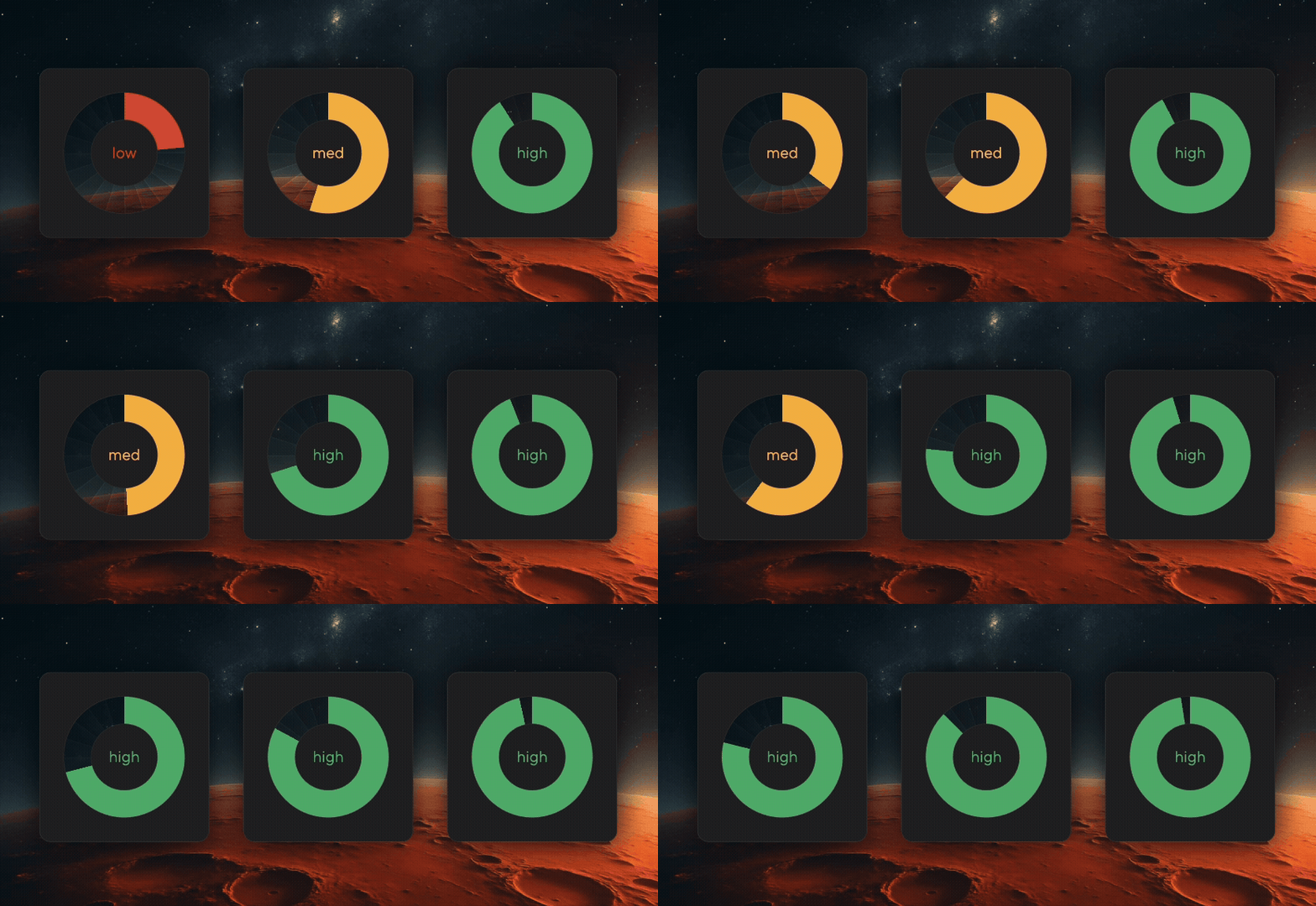
During the animation, the following update automatically:
the fill size,
the scale color,
the center label.
In other words, all styles tied to --progress are recalculated on the fly as the native animation updates the variable.
Conclusion
The key technique throughout this article is using multiple backgrounds with radial and conic gradients. It’s simple, well-supported, and extremely flexible.
Everything else — customization, visual effects, conditional logic, animation — is just an optional layer on top.
If you need a reliable production-ready component, stick to the basic technique. If you’re in an experimental mood and browser support allows it, try the newer features — they’re already available in recent versions of Chrome.
The complete code lives in an interactive, step-by-step demo — you can go through the implementation at your own pace and play with the parameters along the way.
Hopefully, building progress bars in 2026 will feel a lot more enjoyable.